
Categories
Just imagine, while driving your car, you need to look meticulously to know the current speed. Or if an engine overheating light blinks and you need to scan the dashboard to know what light blinked. How dangerous that situation is going to be if you need to search through the dials to know your car vitals. But that is not the case. At a single glance you know what exactly is happening with your car. Same with your company dashboard. Your dashboard should be smart enough to tell you at a single glance where your company is headed to, what is the speed, how much you need to speedup or slow down. Are all the other vital ok. All this you should be able to identify in a single glance. That is how you design a smart dashboard.
The fundamental purpose of a dashboard is to visualize data and understand the story that the data is telling.
Ask the below questions to identify the main aim of the dashboard.
Dashboards are used to display the most vital and useful information concerning your business. You already have the raw data. The dashboard is just helping you with the visual representation. Hence the visual representation should be helpful to get meaningful insights on your data. If interpreting from the visual representation is going to be tough, then the whole purpose of dashboarding is lost.
Given below are few pointers that will help you design a smart dashboard.
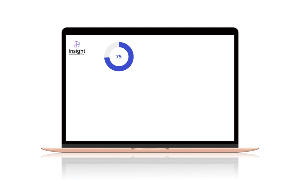
1. Simple Visualization:
Use simple visualization that is easy to understand at a single glance. As in the case of car dials. The driver can understand the vitals even while driving. Similarly, your dashboard should also have smart visualization that clearly communicates your main KPIs.
2. Metrics that Matter:
Visualize only the metrics that you require, do not opt for metrics that are not relevant or exclude those which you do not follow frequently. The metrics should be chosen based on the audience of your dashboard and your ultimate goal. Keep it limited to those metrics.
3. Right Visualization:
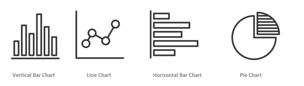
Choose the right chart for visualizing your data. Improper representation might lead to misleading or incorrect interpretation of insights. The most common dials are bar, line, pie charts. Bar and line charts can be very useful. They can even be combined in a single graph to show trends. Pie charts are confusing when the categories are large in number. Hence the right chart needs to be identified for each metrics and that will help in designing a smart dashboard.
4. Story Telling
Your dashboard should visualize your data in a meaning full manner, so that it tells a story of the direction in which the business is moving. The metrics that you see on the dashboard are mere numbers, which when compared with historic highs or lows gives meaningful insights. There could also be thresholds set that indicates when the trend is critical and needs intervention. Also set targets for KPIs, so that the user knows how the business is trending. All the metrices that you have selected, coupled with the insights should tell the right data story for your business.
5. Unique Dashboards
Create unique dashboards for each function, project or different departments. This strategic organizing of dashboards for each purpose ensures precision and also can be targeted at the right audience. If we have a single dashboard that has all the metrices for all departments, then it will be too much clutter and users from each department needs to scan through other department data and filter out their specific metrics. This spoils the whole purpose of dashboarding. Having data categorized in different tabs is also a solution. However, this will not limit users accessing their specific data. Hence the best solution is to have specific dashboards for each function or department or for a focused user group.
A smart dashboard is one that is SIMPLE, PRECISE, CLEAR and UNIQUE. A smart dashboard helps any user to identify vital information with ease and take actions when needed. Following the above points for designing a smart dashboard will help you create a smart data visualization dashboard. However, constantly collect feedback on the effectiveness of the dashboard from the users and tweak your dashboard as per the feedback. This will ensure that you have the smart dashboard that is most suited for your requirement and users.